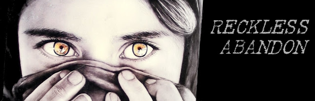
i like it. it seems little hard to read though, or maybe it's just that i don't have my glasses on right now, i dont' know, anything :o
Hurrah for getting rid of the pink! :) I think that this looks quite nice. I laughed when I saw it though, as with several others of your picture choices I recognized it fairly quick.
Amy: Thanks, and yes, I agree with the "hard to read" bit. Once I get my lazy self moving, I'll do something about it. :)W.C: Pink has its place in this world somewhere, but not on my blog. As for me and my house, we will shun pink. Heh, heh.I'm glad I made you laugh... that's part of my blog's purpose. Laughter.:)
i think it might just be the font that makes it hard to read. a more solid one might help. ?
I agree with the others, the font is a bit hard to read, with the "sandy" background, the way the font is "broken up" makes it hard to focus on. It looks cool, but readability?
I think this is much easier to read. You've done a good job. I like the background. It is so cool and unique.
Thanks you :)
Post a Comment

7 comments:
i like it. it seems little hard to read though, or maybe it's just that i don't have my glasses on right now, i dont' know, anything :o
Hurrah for getting rid of the pink! :) I think that this looks quite nice.
I laughed when I saw it though, as with several others of your picture choices I recognized it fairly quick.
Amy: Thanks, and yes, I agree with the "hard to read" bit. Once I get my lazy self moving, I'll do something about it. :)
W.C: Pink has its place in this world somewhere, but not on my blog. As for me and my house, we will shun pink. Heh, heh.
I'm glad I made you laugh... that's part of my blog's purpose. Laughter.
:)
i think it might just be the font that makes it hard to read. a more solid one might help. ?
I agree with the others, the font is a bit hard to read, with the "sandy" background, the way the font is "broken up" makes it hard to focus on. It looks cool, but readability?
I think this is much easier to read. You've done a good job. I like the background. It is so cool and unique.
Thanks you :)
Post a Comment